
The Social Graphics Wave
The first-ever graphics editor at Vox.com, Javier Zarracina recalls how they visualize their information
Nowadays, the cornucopia of graphics seems like a given. However, it was not so long ago that infographics were scarce and lived in closed ecosystems. The majority of graphics were published in newspapers, magazines, or books, and only after they had passed through various loops of editorial vetting. They were expensive to produce, print, and distribute, and there were only a few professionals with the skills and experience needed to create them.
“Social graphics have their own merits and they’re here to stay. It’s important to learn more about them and take advantage of the opportunities they offer”
With the arrival of personal computers and desktop publishing, the process of making graphics changed dramatically and information designers acquired amazing new capabilities: from the ability to visualize big data, to creating complex 3D models, or applying GIS cartography to plot data on maps.
This digital revolution also marked the beginning of interactive experiences that allow readers to explore visual information dynamically on their desktops. We are currently experiencing a golden age of sophisticated, data-rich visualization.
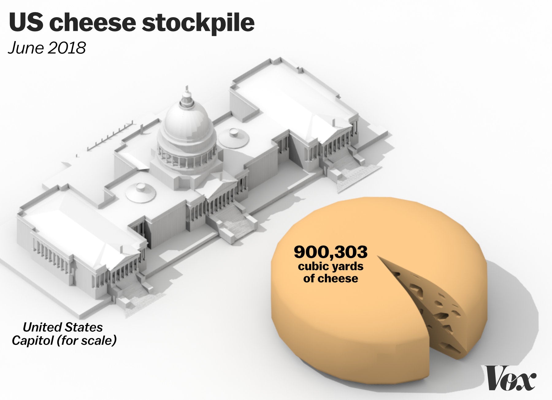
'The US has a 1.39 billion-pound surplus of cheese. Let’s try to visualize that.' A Vox.com story from June 20218. (Graphic: Javier Zarracina / Vox)
The arrival of social graphics and motion graphics that are specifically created for social networks has brought about new changes for infographics, as new players have entered into this ecosystem. Are these social graphics weaker than their bigger counterparts on websites or in print? Whether it’s true or not doesn’t really matter: social graphics have their own merits, and they’re here to stay. Learn more about them and take advantage of the opportunities they offer.
The Social Advantage
So what are the main characteristics of these social graphics? First off, they are based on the attention economy. Unlike graphics on desktop computers or in print, most of these graphics appear in an ever-changing stream of content with only a few seconds to capture the reader’s attention. This creates draconian design constraints: visuals have to be attractive and easy to decode from a mobile phone—screen real estate is precious. Typography has to be versatile so it can be read on different screen sizes and ratios.
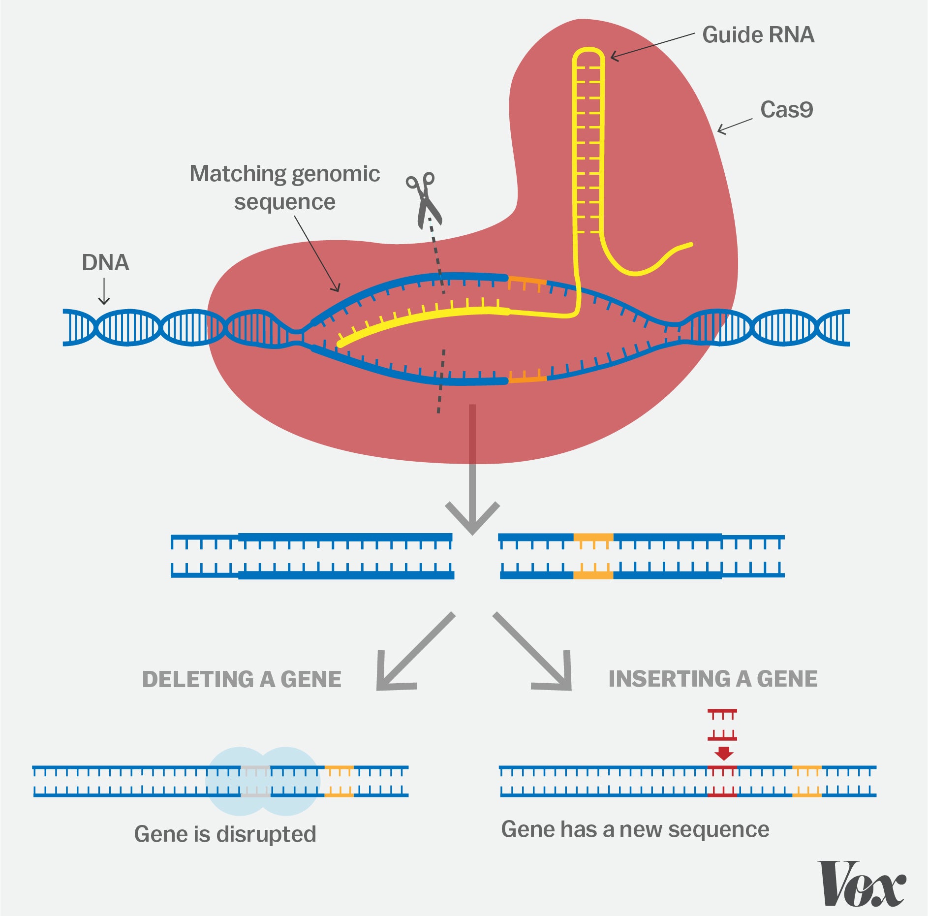
'A simple guide to CRISPR, one of the biggest science stories of the decade.' A Vox.com story from December 2018. (Graphic: Javier Zarracina / Vox)
Despite such limitations, social graphics can convey a substantial amount of information. For instance, during the Summer Olympics 2016, the New York Times published a series of GIFs on Twitter and Facebook summarizing the results of track and swimming events: these award-winning graphics used to design and animation to offer a compelling comparison of the events’ key moments and were worthy opponents to their desktop counterparts.
Editing is crucial for every graphic. However, it is even more so in a social graph, since it has to transmit as much information as possible in just a few seconds. On a website, the space is unlimited; in a social media feed, getting seen is competitive—even more so than it ever was in print. Social graphics have to get to the point and remove any and all superfluous details. For instance, we tried to make a social graphic explainer on viruses as succinct as possible, paring it down to only the most relevant information.
“Social media users don’t just want to be consumers of graphics, they also seek a better understanding of the rules of visual communication”
Another option we have is to use animation, such as loop cycles in GIFs or short social videos. Video content and GIFs are very versatile—and unlike interactive graphics, they work on most devices and social platforms. Years ago, creating a few seconds of animation was an extremely laborious, intensive task, but with the popularity of software like After Effects and other animation packages, the technical part of producing animations is easier today. Short video format eliminates some of the complications of shooting in the field or the need for voiceovers. Infographers can use many of the visualization tools they already use on other platforms: animated maps, charts, and typography.
Risk and Opportunity
All of these opportunities also come with risks. When graphics are published without having gone through an editorial process or are read without context, they can be more easily manipulated and their information more easily distorted. Marketing agencies, PR departments, and political activists know this well, and they often use social graphics to advance their agendas or cast a critical glare at inaccurate or biased information. How can we, as a graphics community, counteract these challenges? At Vox, we have established a dialogue with our audience on social media about methods of making visual representations with graphics about graphics themselves.
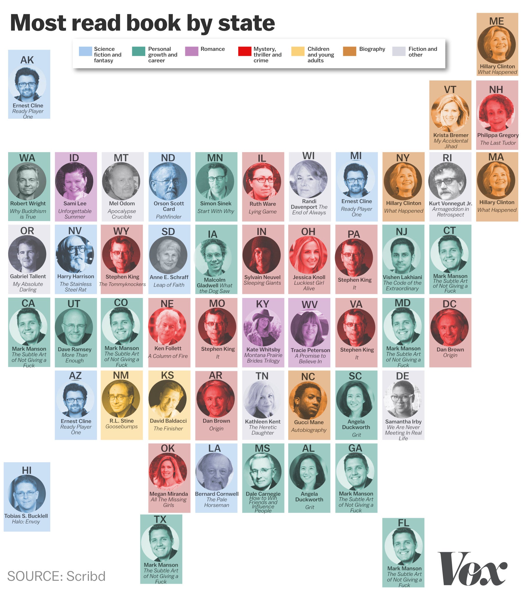
'The most popular books in all 50 states, in one map.' A Vox.com story from November 2017. (Graphic: Javier Zarracina / Vox)
For instance, we produced a video for social media explaining how to choose a map projection, when to use a y-axis that starts at zero, and several pieces analyzing the misrepresentations in the U. S. election maps. At first, these topics might only appear to interest a small audience of data visualization professionals, but we were surprised at their popularity. For instance, our map projections video has more than three million views and counting.
This interest may be because social media users don’t just want to be consumers of graphics. They also want a better understanding of the rules of visual communication since they are sharing—and often creating—visual content. When someone shares a graphic, they want it to be a part of the conversation within their social circle—and that is a powerful interaction to have with readers.
An introduction to Vox News.
If we get a better understanding of such connections, we can access a unique tool in the panoply of visualization options that go far beyond the dichotomies of print vs. online, mobile vs. desktop, or interactive vs. linear narratives.
Some of the best stories in the world are told in graphics. Learn about the masters and visionaries of infographics through Visual Journalism.
