05/2020 design & fashion visual culture
From an early age, Javier Errea dreamed of following in the footsteps of his uncle, Fernando Múgica. A war correspondent who covered numerous conflicts in Vietnam, Lebanon, and Nicaragua, he was instrumental in Errea’s career choice. Even before graduating from college, Errea worked as a writer at Diario de Navarra, the leading newspaper in his hometown, and one of the most important regionally in Spain. At 27, he became assistant managing editor at the newly formed paper Diário de Noticias, and a few years later was appointed art director and deputy editor in chief at Heraldo de Aragón.

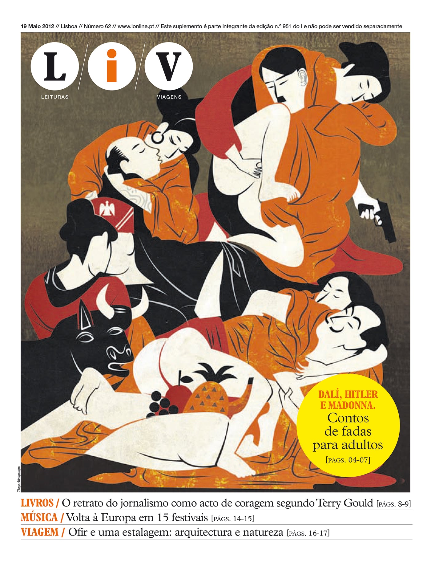
A front page of LiV, the weekly culture supplement of Journal i.
In the print rooms of his youth, Errea looked with skepticism at the processes of both design departments and staff when assembling the newspaper. Once his stories and reporting were filed, he always preferred to create his own layouts. He would also take a cutter and correct the mock-ups. "Journalistic design means order—knowing what goes first and what comes later. Nothing more and nothing less," he explains.
"Design should never be the star. We only provide the tools for newspapers to tell stories of greater interest and reach. We aren’t artists"
Errea did not formally study design. "Everything I know, whether that’s a little or a lot, I learned by doing, by reading, by looking. And copying. I copy a lot. I never stop looking at what other people are doing," he admits. He has a weakness for typography, buying fonts compulsively. He can spend weeks ruminating over which font is best for a certain project, and won’t hesitate to change it at the last minute if he isn’t completely convinced. "Choosing a font is the hardest thing. Typography creates the tone, the precise personality of a newspaper. It is much more than legibility," Errea explains. He continues to innovate and seeks to avoid repetition, yet he forgoes the latest craze and avoids typographical trends.

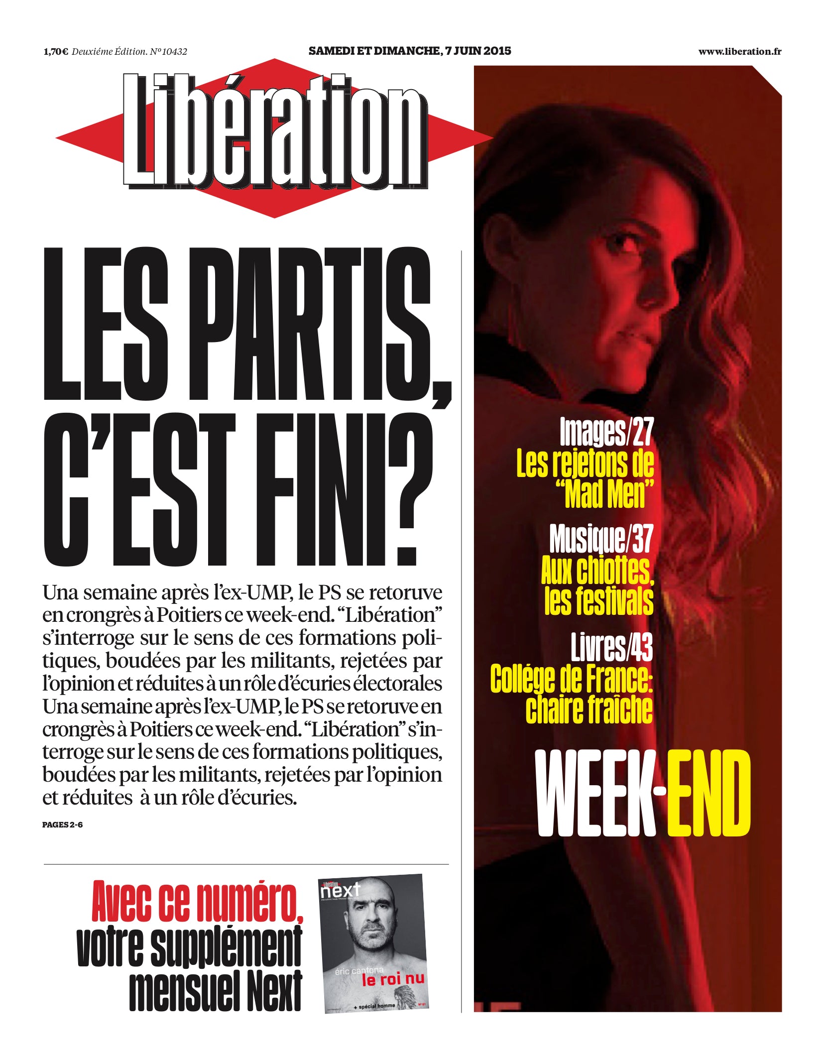
A front page of the iconic French newspaper Libération which Errea redesigned on two occasions: 2009 and 2015.
For Errea, the design is journalism in capital letters. It is an opportunity to inspire change in the newsroom. "We journalists are distrustful. Every time a consultant comes in, we get defensive and believe that they don’t have anything to tell us. But if you come in as a designer, it’s different," he goes to say, "you seem innocuous and that’s when the big opportunity appears. Above all, if journalists realize that you aren’t some alien, but rather someone who cares about the news first and foremost, then they will see that you don’t necessarily defend all designers’ points of view."
When working on a project, Errea remains true to the spirit of a publication, its history, and its context. "Design should never be the star. We only provide the tools for newspapers to tell stories of greater interest and reach. We aren’t artists. There are some redesigns that were clearly conceived to win an award. I prefer authenticity and conviction. I am particularly proud of several of our projects that not all of our colleagues have been able to grasp," he says in reference to major redesign projects for the Independent in London, Jornal de Notícias in Porto, and Libération in Paris that have been perceived as radical by many and criticized by some.

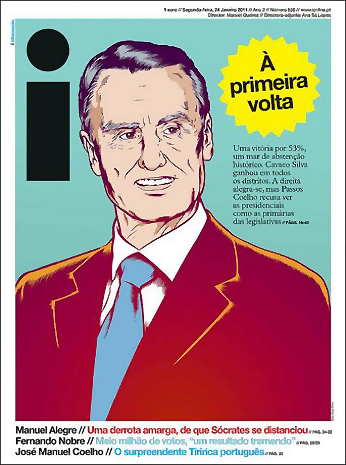
A front page of Jornal i, the revolutionary Portuguese newspaper launched in 2009 and designed by Errea.
These ambitious and stimulating redesigns call into question established conventions. All of them incorporated certain elements of the popular press such as bold fonts, capital letters, or primary colors in order to give the newspaper vigor and a distinct personality. "Not every newspaper has to be elegant, orderly, or modular," says Errea. "The Guardian is an excellent project, but it has caused a larger design problem; all the other newspapers suddenly want to be like Guardian, and each of us designers wants to create our own Guardian. But isn’t that boring? Life isn’t perfect; the best newspapers aren’t either."
While not perfect, Errea has certainly helped win awards. During the 1990s, when he worked as an editor in chief at Diário de Noticias, the Society for News Design (SND) chose the small newspaper three times in a row as one of the best-designed in the world. Later, between 2006 and 2015, his graphics projects led El Economista (Spain), Expresso (Portugal), Eleftheros Typos (Greece), Jornal i (Portugal), and Dagens Nyheter (Sweden) to be named the best-designed newspapers in the world in various competitions. Recognizing the best of journalistic design in Spain, Portugal, and Latin America, La Nación (Buenos Aires) was named as the best national paper in 2016 and 2017; and Aamulehti (Finland) won the award for best Scandinavian paper in 2017.

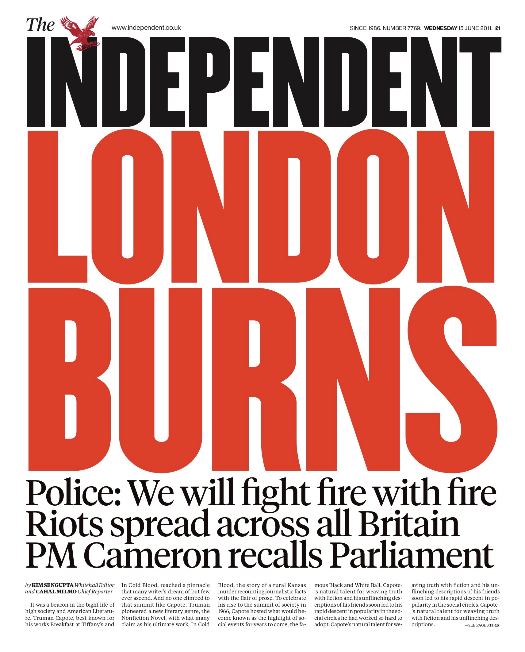
The design for the front pages of the Independent permits any type of graphic solution: photography, typography, poster, etc. In this example, with coverage of rioting in London, the war-time-styled front page resembles one that might have been published during the Second World War.
Today, Errea leads Errea Comunicación, his design studio based in Pamplona, Spain. Eight journalism graduates make up his team. "It’s our strength and, at the same time, our limitation. We journalists aren’t so creative," he acknowledges. Thanks to word-of-mouth, the studio has developed hundreds of projects around the world, some as culturally complex as Al Bayan (Dubai), published in Arabic, or Malayala Manorama (southern India), which has a circulation of 2.5 million copies per day in the Malayalam language.
In 2010, the SND gave Errea a lifetime achievement award for his contributions to visual journalism around the world. In 2016, the Asociación de Periodistas de Navarra awarded him the Teobaldo Prize for Journalist of the Year. "When I went to college, and even for several years after that, I would buy Libération without understanding a word of French, just for the pure pleasure of looking at that newspaper," says Errea. "I never would have thought that one day I would redesign it... twice! It is my favorite project of all time for many reasons. That, and having redesigned the two newspapers in my city, where I had worked when I was a kid. It’s not often that they call you back home."

The first issue of the Portuguese weekly Expresso following its 2006 redesign.
Today, like all designers and consultants of his generation, Errea develops multi-platform projects. Among his most recent are El Universal (Mexico), the Scotsman (Edinburgh), Diário de Noticias (Lisbon), and Barometern (Sweden) and other daily papers from the Swedish media group Gota. "In reality, I apply the same criteria to every format I work in—order, clarity, and expression." Errea defends print, not out of naive, romantic ideals. "Print is still necessary. I can still appreciate some important values in print that digital doesn’t provide. Print means a reduced, physical space where you have the whole view of a story. It takes a different mental focus to proceed. The way we consume the news in print is complementary to digital."
Does print have any future? Every time Errea is asked the million-dollar question, he replies with conviction: "It lies in niche products that can impact public opinion, products which are not narrowly segmented, but focused on general matters in a radically independent way; they will be expensive and free from advertising."
Explore the best of editorial, graphic design, and infographics through Newspaper Design.

