A Legacy in Letters with Erik Spiekermann
A toast to a master of graphic design and typography on his birthday
Undoubtedly one of the most revered and admired graphic designers and typographers of today, Erik Spiekermann is the architect behind some of the best-known branding and visual identity campaigns of the past generation. "If you ever take the train in Germany, everything you read was designed by us," Spiekermann once famously said about Deutsche Bahn. His influence on contemporary graphic design is irrefutable, his legacy is visible when reading The Economist or looking at an Audi. Turning conceptual sketches into symbolic substance, we pay homage to the personality and professionalism of the ‘German font god’ on his 73rd birthday.
When one looks at Erik Spiekermann’s life’s work, one is not only struck by the sheer abundance of quality work. Words, type, and design are connected to entrepreneurship, networks, and technical knowledge. He has created an impressive graphic cosmos that has had a massive influence on graphic design in Germany and abroad. (Photo: Hello, I am Erik)
Born in Stadthagen on April 30, 1947, Spiekermann will be the first to tell that he represents one of the last individuals from the iconic golden age of analog letterpress. An early adopter of digital graphic design in the 1980s, he became the voice of a generation through MetaDesign (founded 1979) and FontShop (founded 1988). The self-taught artist learned his craft in his own cellar printing shop in Berlin. Although he made his mark in London, the world’s omphalos for graphic design at the time.
From MetaDesign’s inception in 1979 to leaving the company in 2001, Spiekermann led Germany’s largest design firm overseas into London, Amsterdam, and San Francisco. The modern success stories behind Volkswagen, Heidelberg Printing, and Bosch can be attributed in part to his visual identity.
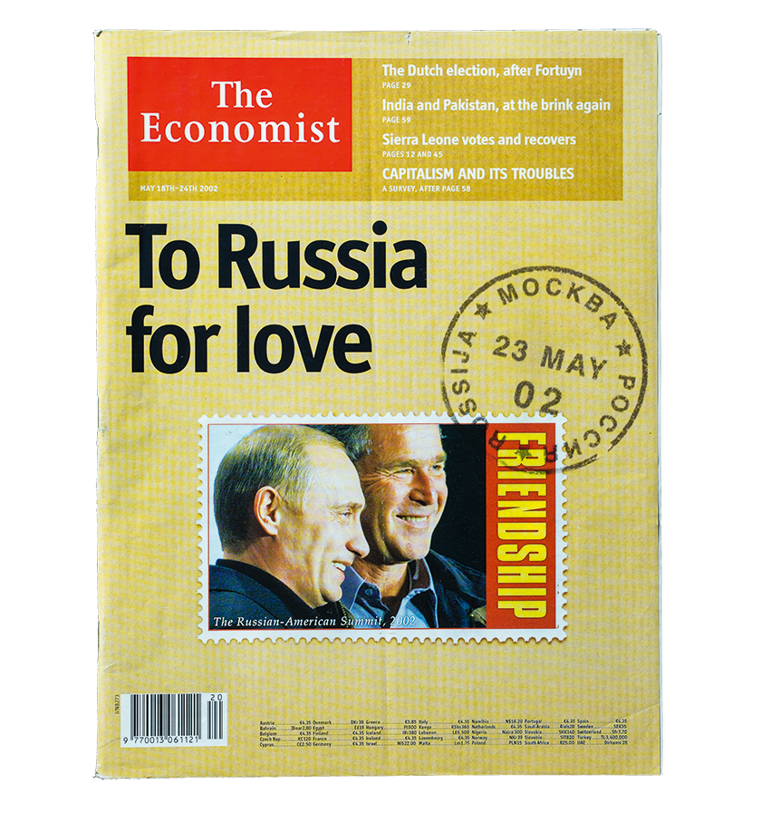
Spiekermann and three colleagues at MetaDesign London were responsible for the new design of The Economist. "We reworked the text face, introduced another new typeface for navigation and information hierarchies, improved the access to content via a more clearly designed, two-page table of contents, and, above all, introduced color throughout the publication, which until then had been seen as totally impossible." (Photo: Hello, I am Erik)
In 1990, Spiekermann was the first foreigner commissioned to design a series of Olympic stamps for the Dutch postal service. The challenge was to show five sports on four stamps: volleyball, athletics, rowing, skating, and field hockey. The Olympic rings were an important design element.
The typeface ‘Transit’ was created exclusively for BVG signage, based on ‘Frutiger Condensed,’ and published commercially in 1997
Since Spiekermann himself admits he is a typographic designer rather than an illustrator, he developed a typographic picture created from the white markings typical of each sport against gray playing fields. The names of each sport were on the margin on a colored strip. Without perforations the picture appeared to represent five separate stamps—however, with the word ‘Netherlands’ and the postage value, four stamps emerged, each one in two of the five Olympic colors. This design was a little too ‘Teutonic’ and lacking in color for the client, so pictures of athletes were added.

The four stamps on an envelope also designed by Spiekermann stamped on the first day of the issue. (Photo: Hello, I am Erik)
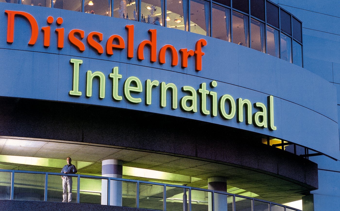
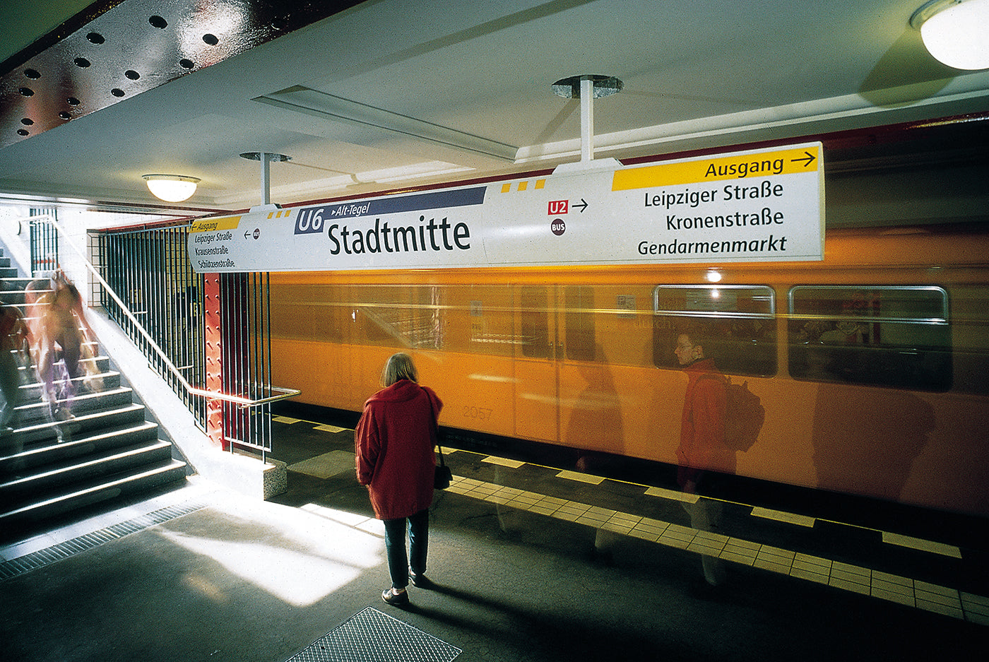
A map and navigation master, he is the design architect of Berlin’s transit system and Düsseldorf Airport among others. After the reunification of Berlin in 1990, there was no unified information system for public transport. Right after the fall of the Berlin Wall, MetaDesign designed the first standardized schedule book for East and West Berlin with new city and route maps. Starting in 1991 the team, led by Spiekermann, was commissioned to develop a new signage system for the Berlin public transport company BVG, from which the new corporate design emerged with its main parameters: fonts, symbols, layouts, and company colors. The new information system was tested at the transport hub Alexanderplatz before being installed in the entire subway system. Previously, vehicles had been colored white, gray, beige, lemon yellow, orange, or red. Spiekermann introduced yellow as the sole color. The typeface ‘Transit’ was created exclusively for BVG signage, based on ‘Frutiger Condensed,’ and published commercially in 1997 as ‘FF Transit.’ The signage still works well today but is being watered down in a few areas.
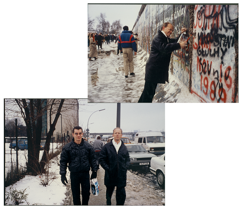
After the fall of the Wall in November 1989, Neville Brody, a friend of Spiekermann’s for years, visited Berlin and wanted to see the changes for himself. Brody along with Erik and Joan, his wife, founded FontShop in 1988. (Photo: Hello, I am Erik)
Small may be beautiful, but big is successful, he explains in Hello, I am Erik. “Over the course of the years in this business, I have learned that large companies prefer to deal with other large companies when it comes to the big stuff. Thus, design companies in the States have long behaved and felt like big companies. That’s why they got contracts from their business partners at the major companies who were after safe, evolutionary solutions, rather than creative surprises. Corporate identity and corporate design were global buzzwords in the 1980s, which shows how both language and business practice had become very Anglo-Saxon. German clients looking for designers with a strategic approach were more or less forced to go to London,” he explains.
The new signage had to be installable with simple means in historic stations. The workmen did not always go about this in the most subtle way, as one can see from the holes in the ceiling, still visible today. This project started in 1990 and ran until 1994. (Photo: Hello, I am Erik)
At the time all the most important projects went through design companies in America, England, and Switzerland. He recalls Germany instead of being recognized for products and product design but hadn’t quite yet been admitted to graphic design’s premier division. But over the course of four decades, Spiekermann helped reverse that. Treasured and feared in the design world, he is an idolized figure that paved the way for countless generations after. Celebrated graphic designer and critic Michael Beirut in the book says, “the ability to reduce complex ideas to unforgettably simple forms is a remarkable gift. Erik can do it with typefaces, or images, or words, and—seemingly—in any language. That is the mark of a great designer, and that is what Erik Spiekermann is.”
“We practice post-digital printing. Our motto is ‘Preservation through Production’
“Spiekermann’s unostentatious design has certainly crept into the way we perceive things, without us noticing it. The art lies in its implicitness,” Melanie Mühl once said. In 2001, he took on the redesign of the outdated newspaper The Economist, helping to bring them into the new millennium. Their circulation went from 500,000 to almost one million at the end of the following year. In 2009, he became the European Ambassador for Innovation and Creativity by the European Union. The German Design Council awarded him their 2011 Lifetime Achievement Award, the highest such award in Germany. The same year he was the 25th recipient of the TDC Medal, awarded by the Type Directors Club New York.
To coincide with the gestalten release of Hello, I am Erik, which was co-edited and designed by Johannes Erler, and in close cooperation with Erik Spiekermann, we visited him at Galerie P98a to reflect back on his legacy.
After decades of accolades, he moved away from the digital world. He says, “we practice post-digital printing. Our motto is ‘Preservation through Production.’ We certainly are not Luddites.” As one of the last masters of analog design, he is using his life experiences to nurture the next generation and preserve the craft. “I want the design to make things easy to use as well as beautiful to behold,” he recently said.
At the beginning of 2014, Spiekermann installed his printing press in a beautiful white room in a former girls’ art school in the back courtyard of a house in Berlin’s Potsdamer Straße, directly opposite Edenspiekermann, which he stepped down from the year before. It is called Galerie P98a after its street and house number. In 2019, next door to the printing press, Spiekermann joined forces with a selection of Berlin-based publishers and platforms to open Analog on Potsdamer Straße 100. The concept store, which gestalten is a partner in, is a hub for everything related to typography, design, photography, and art.

The Spiekermann gallery workshop in Potsdamer Straße, Berlin combines traditional handwork with digital technology such as Risographs and 3D printing. (Photo: Hello, I am Erik)
Erik Spiekermann revolutionized his field, took it digitally, put Germany on the global stage of graphic design, shaped contemporary typeface, and transformed the identity of the world’s most recognized brands. An obsessive attention to detail and a healthy knowledge of analog and digital production methods earned him international respect. He advanced and evolved design, but today is more focused on preserving the methods and techniques that shaped the beginning of his career.
The visual biography Hello I am Erik is the first comprehensive exploration of Spiekermann’s influential career with contributions by Neville Brody, Mirko Borsche, Wally Olins, Stefan Sagmeister, Christian Schwartz, and Erik van Blokland. Available in German and English.

